Data Quality Report for GS1
Analysis: SQL, R (xlsx, plyr, ggrepel).
Visualization: R (ggplot2).
The report shows a quality of data in database. It helps to answer the following questions.
From where come a new data?
Is a new data qualitative?
Here you can see only two diagrams of the report.
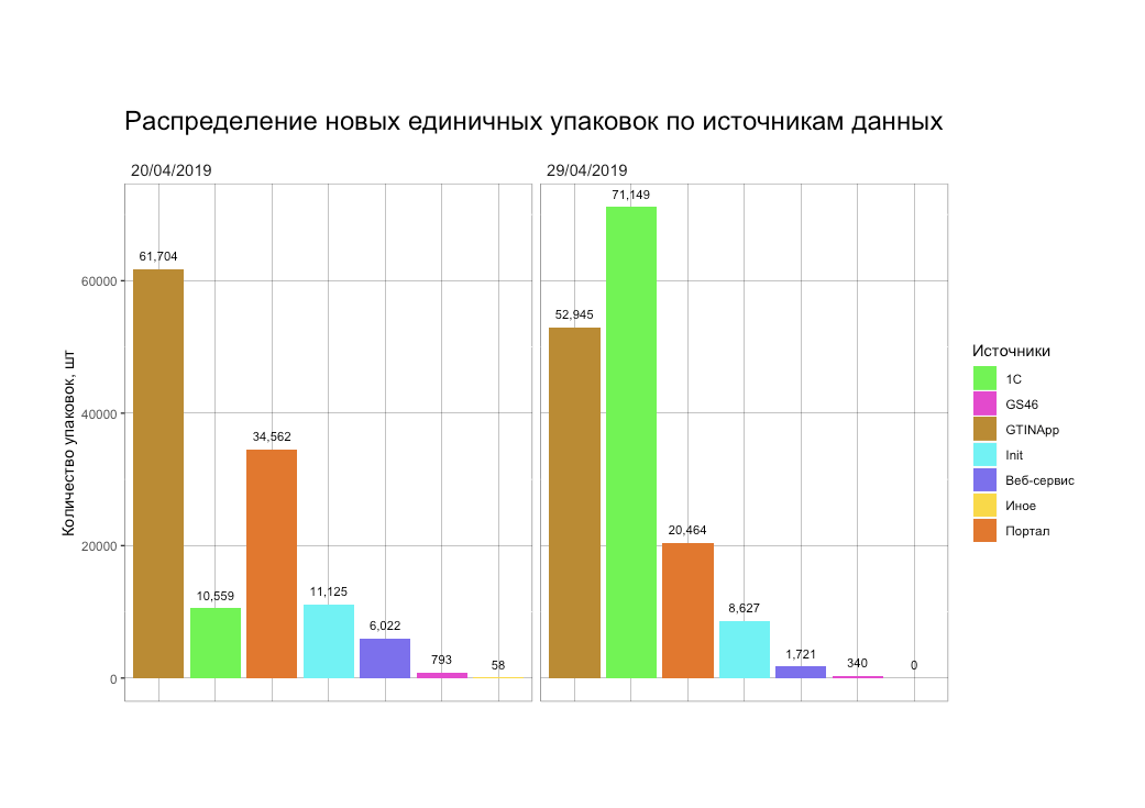
The first diagram tells from which source came data for certain period. There are six different sources. Knowing this information you can concentre more on the most popular sources to make them better for users.
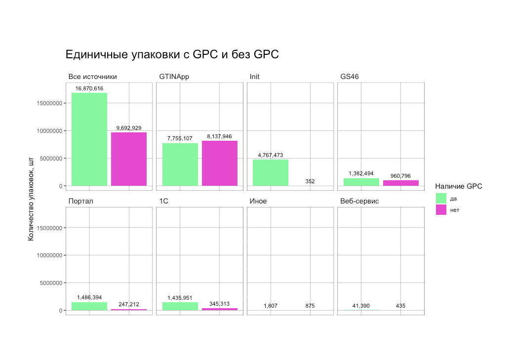
The second diagram tells how many products are classified with GPC (Global Product Classification) and from which sources comes classified and unclassified data. This information helps to make a decision which source we need to improve to get qualitative data.
The report gives information about data in the database and helps make a decisions to improve a service.


