GTINs Registration Dynamics for GS1
Analysis: SQL, Python (pandas).
Visualization: Python (plotly).
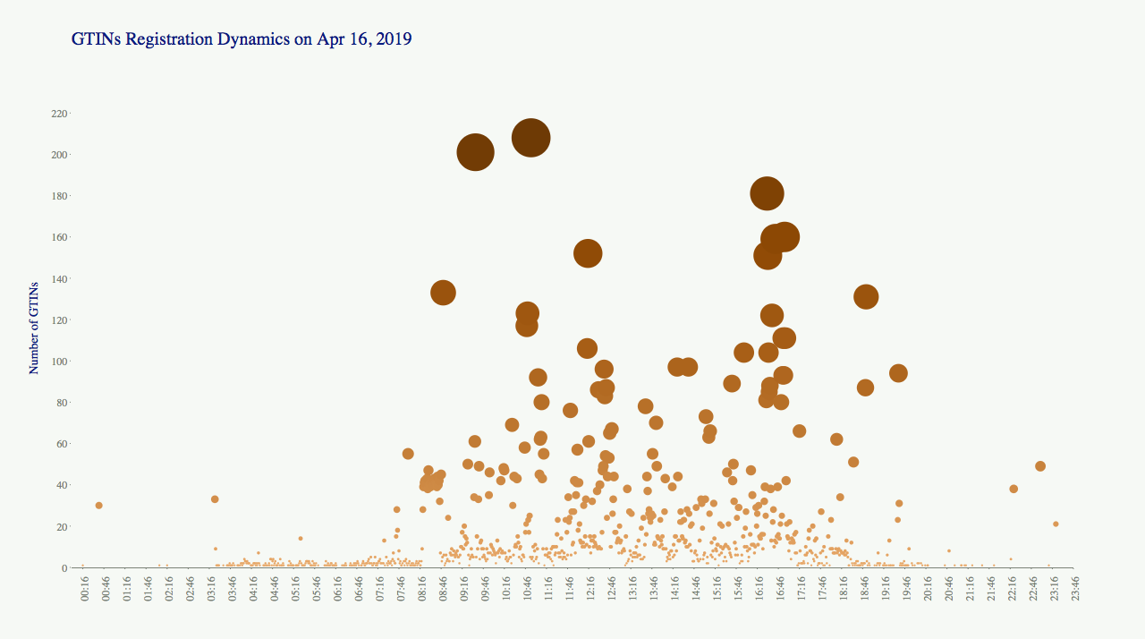
The report shows a dynamics of GTINs registration daily and weekly. This is only one of diagrams from the report showing dynamics on April 16th.
This report helps to know more about activity of users. When they are the most active? If someone works with the system at weekends? And it’s helpful to know an amount of a new data adding every day to the database.

